

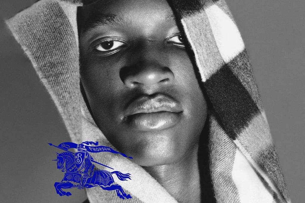
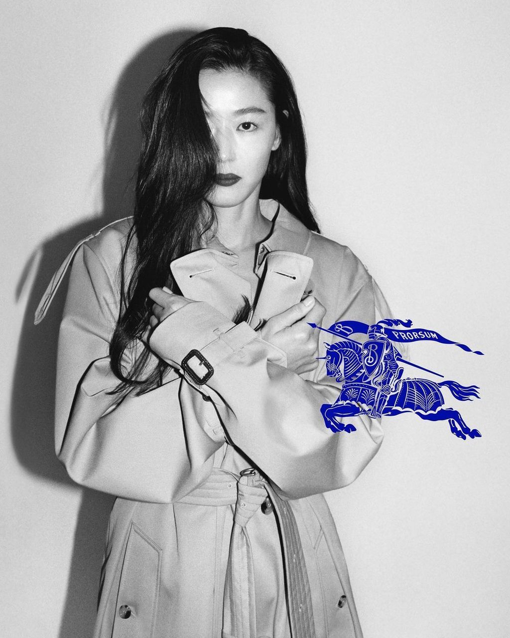
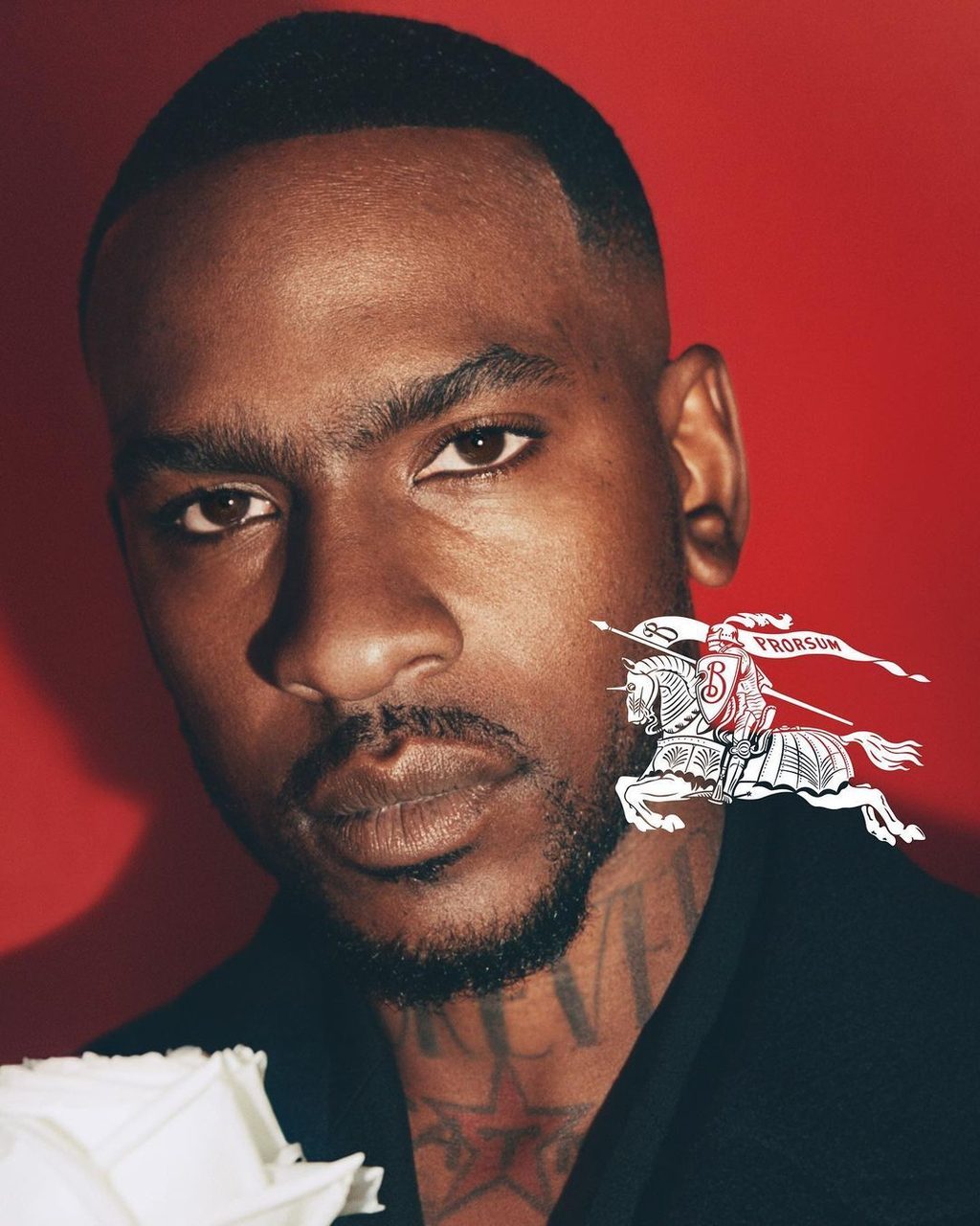
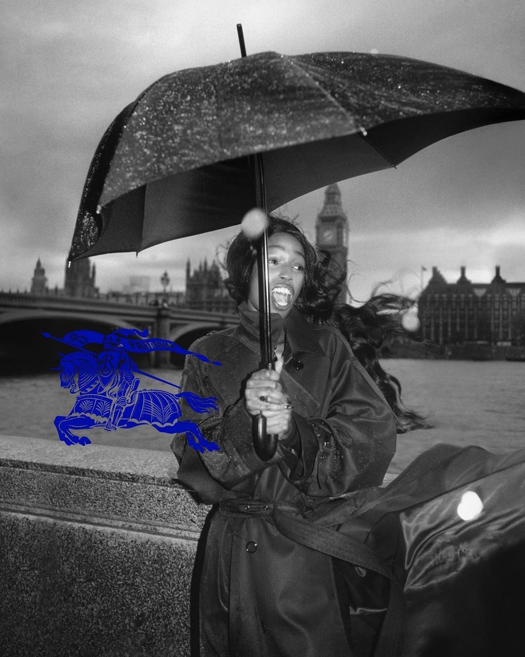
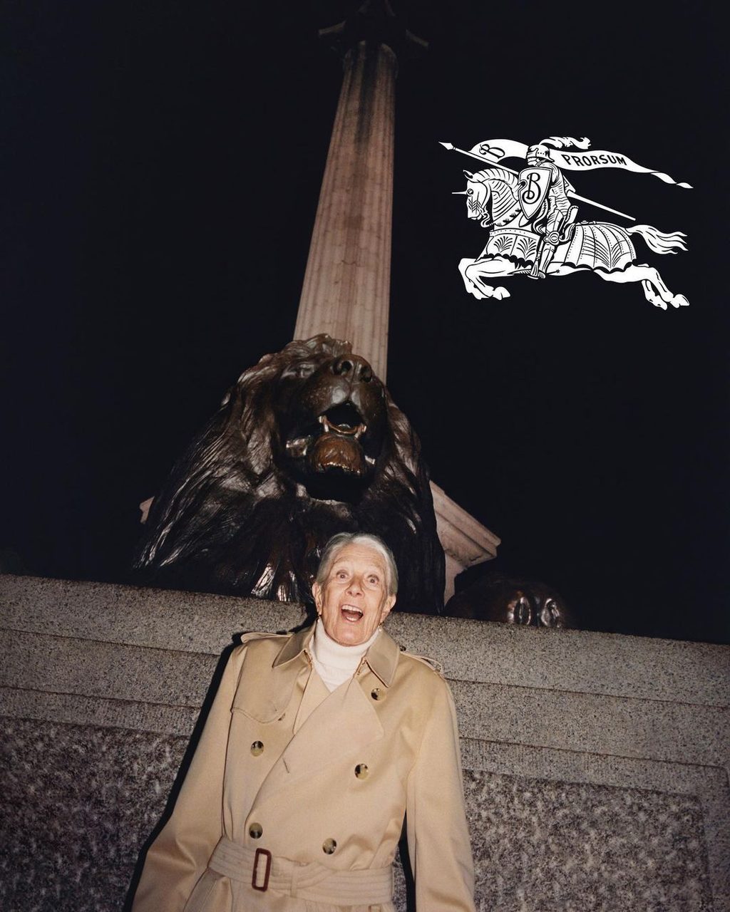
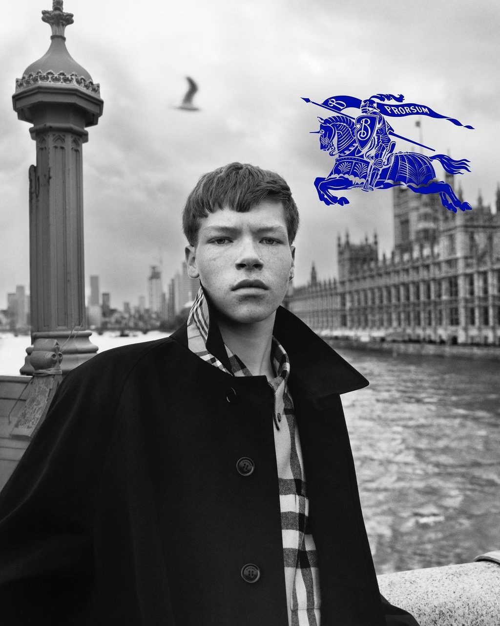
It’s giving heritage. Daniel Lee, the ex-Bottega Veneta designer who was appointed to Burberry just last year, has just released his first “Creative Vision” for the British heritage brand, a campaign which features the likes of Skepta, Shygirl and Lennon Gallagher. No product has been shown yet, but we can deduce a lot from this campaign. The talent that Lee chose for this campaign obviously appeals to a younger generation of Burberry clients, which is not a surprising decision considering most brands appoint new designers when it’s time for a general refresh. The bold move Lee did make though, was the logo rebranding, opting to bring back the 1901 Equestrian Knight “Prorsum” logo.
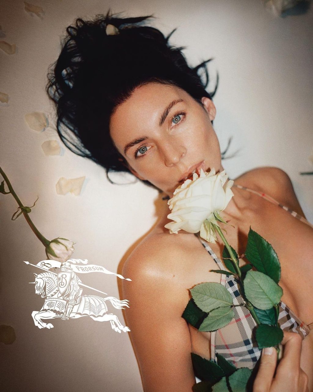
The meaning behind the Equestrian Knight Device is a highly detailed logo that was introduced when the brand was still called Burberrys and is packed with symbolism - “the knight represents honour, the shield protection and the lance reform”, states Burberry. The design may look dated in today’s eyes, but actually, “Prorsum”, the wording found across the knight’s banner is actually Latin for “Forward”, something Lee had to have taken into consideration. The logo has now been reworked in a royal navy and an all-white with black outlines, without forgetting a single line or stroke of the highly-detailed graphic.
[Image: https://culted.com/wp-content/uploads/2023/02/3-11-819x1024.jpg]
Another aesthetic change Lee has graced us with is a new typography. The Burberry name is now written with a serif font - meaning there are little strokes at the end of the letter’s main strokes - giving it a much more traditional look. Sure, it’s subtle, but it’s there. This new update comes only a few years after Burberry changed its name font. In collaboration with British designer Peter Savile during the time of Riccardo Tisci’s creative direction, the Burberry name was stripped of its outlying stroke into a standardised sans-serif font (without those extra little strokes) giving it a ‘cleaner’, easily legible, more modern look.
So what do these detailed choices under Lee’s creative direction actually mean? Let’s start with the ‘serification’ of the Burberry name logo. During the 2018 to 2019 pre-pandemic era, fashion brands experienced their own kind of pandemic: the uniformisation of brand logos. There was a movement that was led by tech companies like Google and Spotify dropped their old brand logos which used different fonts and accompanying detailed graphics to go for a sans-serif all-black name logo instead. Fashion companies quickly followed the trend.
From Saint Laurent to Balmain, and of course Burberry, no fashion house was safe from this creative purge. So for Daniel Lee to return to an ‘older’, more traditional-looking brand name logo is actually quite revolutionary in today’s day and age. The designer is putting an end to the modern look era. The designer is putting an end to the modern look era by reinjecting the brand with its old-age creativity. Because of this, Burberry is now going to stand out from the rest, with its logo quite literally looking different.
Just like with the Equestrian Knight Device, Lee is actually attempting a rebrand of sorts where tradition meets modernity without compromising its creativity. Re-introducing this logo, which had been removed in the Peter Saville remake, is quite a first for a modern fashion brand, considering detailed-heavy anything hasn’t been the move for a while.
Could this mark the end of the logo-slapped crewneck and tees as a brand’s main output of product? Will Burberry’s focus shift to heritage values, design and quality above all? Could Lee be the first of many to wave goodbye to the sans-serif logo era?
Lee has, rightfully so, gained notoriety as a master rebrander during his time at Bottega Veneta, turning the brand into one of the most profitable and beloved for its highly marketable and saleable accessories without compromising its identity. What the designer will give us in terms of clothing, we’ll see. For now, he’s making bold moves and honestly, it’s refreshing to see.
More on CULTED
See: PHARELL WILLIAMS, ALICIA KEYS, RICK OWENS AND MORE: MONCLER THE ART OF GENIUS