
Ever since his first album and throughout the rest of his ongoing career, The Weeknd has managed to carve himself out both musically and stylistically as a defining artist of our time. Constantly reinventing himself with each new release, The Weeknd’s eras are crafted and inspired by his highly publicised life that we have been witness to, from cultural references to gritty breakups and everything in between. We’ve seen the artist come out of Toronto’s underground music world to transform into a 70s L.A. inspired icon, all while creating music we’ve all sang along to, whether it be the promiscuous The Hills or the catchy pop anthem Starboy.
THE TRILOGY ACT
Still revered as his greatest era by some of his long-time loyal fans, Abel Tesfaye embodied and became The Weeknd with the release of his first album “Trilogy” in 2012. Composed of three mixtapes - “House Of Balloons”, “Thursday” and “Echoes Of Silence” - this album was a culmination of everything the artist had experienced up until this point: the gritty lifestyle bordering Scarborough and Toronto where he grew up.
The album itself offers a new look into the RnB genre. The dark, sex and drugs infused “Trilogy” was an introduction to The Weeknd’s persona, themes that would further be explored on later works, though under different lenses considering his experiences span out of his childhood hometown. Breakout hits such as High For This invited us into The Weeknd’s troubled environment where we can hear him repeat the words “You wanna be high for this”, tapping into a generation of young listeners who themselves felt stuck in their hometowns, using any form of distraction available to escape their reality.
This dim and dingy personal album was reflected through its aesthetic branding. The album cover itself is found in black & white, where The Weeknd can be seen embraced by a faceless woman, perhaps a symbol of needed distraction for him. This era was deep into the black & white look, with Abel putting out expired film and Polaroid pictures in those tones in a series of art works inspired by the demo aesthetic.
COME TO KISS LAND
If The Weeknd had never set foot on a plane during his early years, by the time “Kiss Land” dropped the artist certainly had, considering this era became a fever dream out of Tokyo. Being inspired by the Japanese city’s culture and its sci-fi inclinations while on tour there, The Weeknd’s international experience felt like a “different planet” to him. While “Trilogoy” was a product of his environment, “Kiss Land” feels like a fictitious world invented by the artist where the possibilities seem limitless, but the fears and worries of fame very real.
Sticking to his regular black colour scheme for the accompanying artworks, the “Kiss Land” era also featured neon greens, yellows and magentas inspired by Tokyo’s famous lights. There was anime and Japanese bold typeface that came into play, notably in the music video for the single album title Kiss Land. The Town and Adaptation also quickly became fan favourites, with their mid-tempo beats and melancholic lyrics that dives into Abel’s toxic behaviour patterns that he’s trying to break away from.
THE BEAUTY BEHIND THE MADNESS OF SUPERSTARDOM
While Abel’s first releases garnered him an international following of fans, it was 2015’s “Beauty Behind The Madness” that propelled him into the limelight. With raunchy, unfriendly-radio hits such as Often and The Hills that still somehow made their way onto the radio, “Beauty Behind The Madness” was a stepping stone in Abel’s career. While incorporating all the elements that made “Trilogy” the beloved album that it is, the artist also sees himself stepping out of the Toronto lifestyle and embracing the chaos and sins of Los Angeles by adding in features by artists such as Lana Del Rey and Labrinth.
Still in touch with his debut album, The Weeknd’s third studio album also leans on the black & white raw aesthetic, notably the cover which features a collage image of the singer’s face as if ripped and pieced back together, perhaps alluding to the fact that he was trying to reconcile with his past self whilst also reinventing who is now and who he will be in the future.
Artwork to promote his album also featured 35mm shots of himself in his new home of L.A. as well as horror and psychological thriller films-inspired pieces. Artist Kalen Hollomon, which The Weeknd worked with on this album, has mentioned being inspired by vintage Italian horror movies as well as classics such as Eyes Wide Shut. The thrilling nature and anxiety-ridden feelings of moving to a city with a reputation like Los Angeles is imbued throughout the album, notably in the lyrics from In The Night that state “In the night when she comes crawling / Dollar bills and tears keep falling down her face / She'll never walk away”.
HE’S A STARBOY
Away with the black & white visuals as The Weeknd embarked on a full blown bright red, yellow and blue colourway for his next era, the “Starboy” era. Released in 2016, this album strayed away from the artist’s usual dark RnB into a more electro-pop feel that had us all singing “ha-ha-ha-ha-ha / I’m a motherfuckin’ starboy”. Inspired by David Bowie’s 1972 “Starman”, Abel’s 2016 “Starboy” explores themes of coming to terms with his global fame and his evolution since his Toronto days.
Tapping photographer Nabil Elderkin to capture most of the visuals for this album, Abel dropped a 12 minute titled “M A N I A” teasing the upcoming album’s songs and visuals, which were deeply rooted in red and blue hues. This era also saw The Weeknd lean into one of his greatest points of inspiration: cinematography. Notably inspired by The Neon Demon and Drive directed by Nicolas Winding Refn, the music videos from this era were decorated with vibrant neon lights, notably the pinkish red cross that Abel carried both in the Starboy and Die For You video.
From collaborations with Kendrick Lamar and Daft Punk, this felt like a natural evolution to the artist’s image, whose fame was ever growing. Now fully embedded into L.A.’s culture of fame and fortune, The Weeknd saw his future much brighter than during his Toronto days, which translated both visually and sonically into this album.
GOING BACK TO HIS DARK ROOTS ON MY DEAR MELANCHOLY
Released in 2018, “My Dear Melancholy” was technically released as an EP rather than an album, as it is significantly shorter than his other projects with only 6 tracks and one A Capella version of Call Out My Name. While The Weeknd was decked out with fluorescent lights in his last album, this one felt like a reconnect to his past, where dark lyrics and a, as the album name states, melancholic feel.
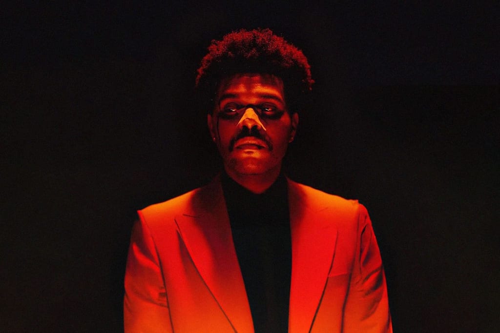
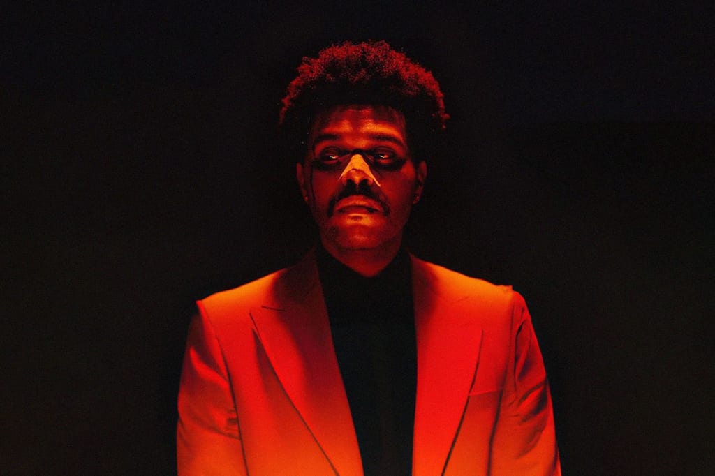
“My Dear Melancholy” was the first album we had heard from the artist after his split back in 2016 with Bella Hadid, a relationship that was highly publicised. Dealing with heartbreak and feelings of hurt, guilt and loneliness, the chosen colour for this album was a grainy orange, reminiscent of the flames of fire representing the destruction Abel was experiencing. The natural elements also came into play in his music video for the lead single Call Out My Name, where the singer is seen fighting against strong winds, trying to keep moving forward no matter the hurdles that were being thrown at him.
AFTER ALL THAT, AFTER HOURS
Moving on from a place and time of hurt, The Weeknd’s next project “After Hours” released in 2020 was truly appreciated by those who had been following the artist since his early days. Incorporating his now iconic hues of red, juxtaposed with cool blues and the addition of mysterious greens, “After Hours” was an era that engulfed everything that had and continues to inspire the artist.
Turning to a classic horror movie, The Exorcist, The Weeknd created his own typeface for this time, dubbed ‘Abel Roman’. From Casino to the Joker, the cinematic inspirations and references were rich in numbers in his music videos. We also saw a new location in The Weeknd universe, Las Vegas, which brought the flashy aesthetic to the next level. From Blinding Lights to Save Your Tears, Abel rocked the red suit and retro 70s squared yellow-tinted glasses which became synonymous with his image.
Eventually, the “After Hours” era reached its peak during The Weeknd’s Super Bowl halftime show performance, which gave us Las Vegas lights, the red suit, and the viral moment that saw a startled and confused Abel close up to the camera trying to find his way out.
THE AGEING OF THE WEEKND ON DAWN FM
Entering his granddad era, “Dawn FM” is synonymous with a wrinkly Abel. Having played with facial prosthetics last album to enhance his jawline and cheekbones in a botox-gone-wrong look, 2022’s “Dawn FM” moment saw the artist age by at least 40 years with prosthetic wrinkles. Toying with the idea of the future, cyberpunk became a key aesthetic to this era.
Inspired by 80s music and aesthetics, “Dawn FM”’s roots are clear but The Weeknd still puts his own spin on the sci-fi retro-futuristic look. The leading single Take My Breath’s music video takes place in a futuristic, BDSM-inspired club of which we only see snippets of through the flashy lights, a theme continued in Gasoline. We also saw the use of a holographic typography used throughout this album done in collaboration with artist Robert Beatty, as well as creating graphics that felt like a blend of Pink Floyd’s “The Dark Side Of The Moon” and Stanley Kubrick’s 2001: A Space Odyssey. “Dawn FM” felt like a concluding, coming of age project, leaving the artist to dive into what could be his afterlife, after taking to his Twitter to hint at a possible new trilogy.
More on CULTED
See: DISCOGRAPHY AUTOPSY: TYLER, THE CREATOR AND HIS MANY PERSONALITIES
See: DISCOGRAPHY AUTOPSY: PHARRELL’S ASCEND INTO SUPERSTARDOM